One Room Challenge || Week 6 - The Reveal - Playroom
Welcome to the BIG REVEAL of this fall 2018 One Room Challenge! You can see the prior weeks here, here, here, here and here. If you follow me, you know I love this challenge and have been a part of it a few times already as both a ‘featured designer’ (way back in the day!) and as a ‘guest participant’ most recently (you can see my past room transformations here). Yes, I’m such a fan that I have a special section dedicated solely to the One Room Challenge on my blog.
As a refresher of what this room originally looked liked please make sure you see Week 1 in order to fully appreciate all the goodness coming to you in this post and to realize the long way we have come. To remind you, the plan for this playroom was to create a fresh, young and sophisticated space for an 11 year-old that would carry her through graduation and beyond. Additionally, this room needed to be multi-purpose: we needed a soothing place to study, a comfortable place to do group projects, a reading nook, a cozy place to watch movies and overall an attractive and fun place to just hang out. Tall order!
To prepare the canvas for the lovely design we had in mind, we did a few things first. To start off with, we painted the entire room with Benjamin Moore Graytint. We LOVE this color. Let’s just say we are now fans for life of this hue (to read more about this paint choice please see here). We also changed the carpet from a scary green to a relaxing white. This also helped brighten up the room in a major way. The white just feels so inviting. The green backsplash tile of the bar area was taken out as were the black countertops and were both replaced by beautiful white quartz. The change was astounding! How can these small changes make such a huge difference? The devil is in the details my friend! That’s why! The bar area now ties so nicely into the rest of the space. We also added storage to the bottom of the open bookcase, which also felt subtly life-changing. With this addition, we now had much needed storage space and the bookcase now felt finished and elegant. (See here for the before photos. I promise it is worth it!). With this our perfect clean canvas was set.
Before we move on to the fun decorating part I have to thank Mr. and Mrs C. for being star clients and for letting me transform this space for them. They trusted me every step of the way and were always so open and flexible. Plus, they just have really good taste, so it was an easy collaboration!
Ok. Photo time!! Let’s start with the study area- Tadaaa!!!!
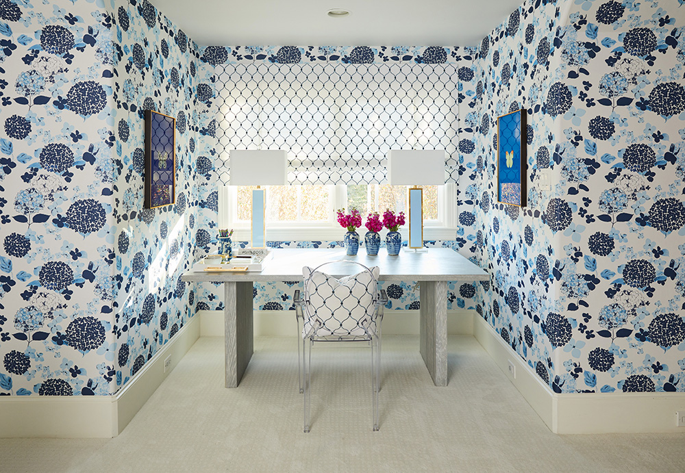
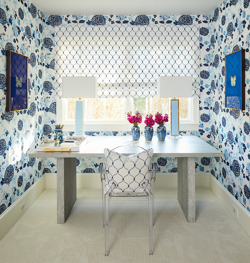
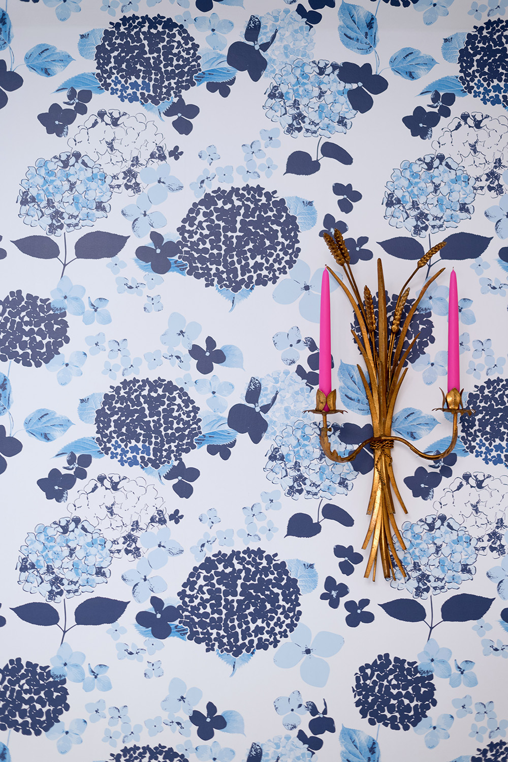
One of the main design elements of the room plan was to have a beautiful and impactful accent wall that would set the tone for the room, add coziness and plenty of punch and personality. I shared my accent wall idea with Jennifer from The Pink Pagoda and during this conversation she mentioned she was working on a wallpaper design- currently the first in a series. Long story short (you can read the longer version here), we agreed to collaborate on this project. And the beautiful wallpaper you see in these photos is her creation! Stylish, fresh, elegant and so different! And to top it off it is of the best quality printed by Milton and King. Now I can’t wait to see her next wallpaper design!
To counterbalance this whimsical and bold wallpaper we chose a simple, complimentary fabric from Fabricut with a plenty of white and structured blues. The fabric design is the perfect pairing for our wallpaper. It is embroidered and the detail of it is just beautiful. Additionally, the desk is so pretty! We are all really in love with it. The surface has chic gold detailing that you can appreciate in the closer-up photos.
In general, the feel for this study area had to be just right for good old-fashioned studying. You can’t beat the combination of natural light with these beautiful patterns creating an inspired space for homework.
Let’s see more angles-
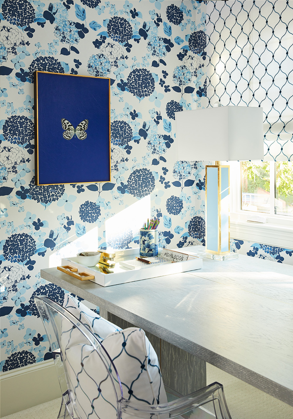
Isn’t this butterfly art piece so pretty?! Take a look at the slew of these butterflies available in all sorts of colors.
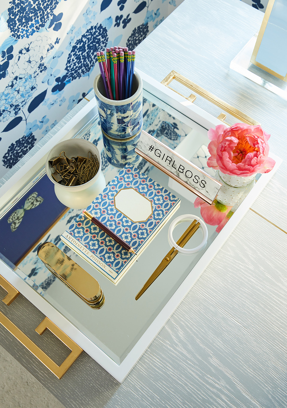
Aren’t you adoring this white tray with gold handles from Couture??!! We could not have been more excited when we opened the box for this. It is so much more beautiful and substantial in person. It is luxurious and totally fabulous.
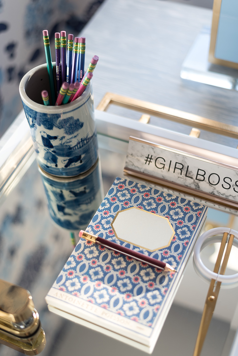
The pencil cup holder is so cute! It is perfect to keep all those pens and pencils organized!
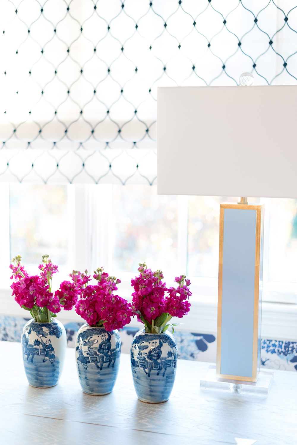
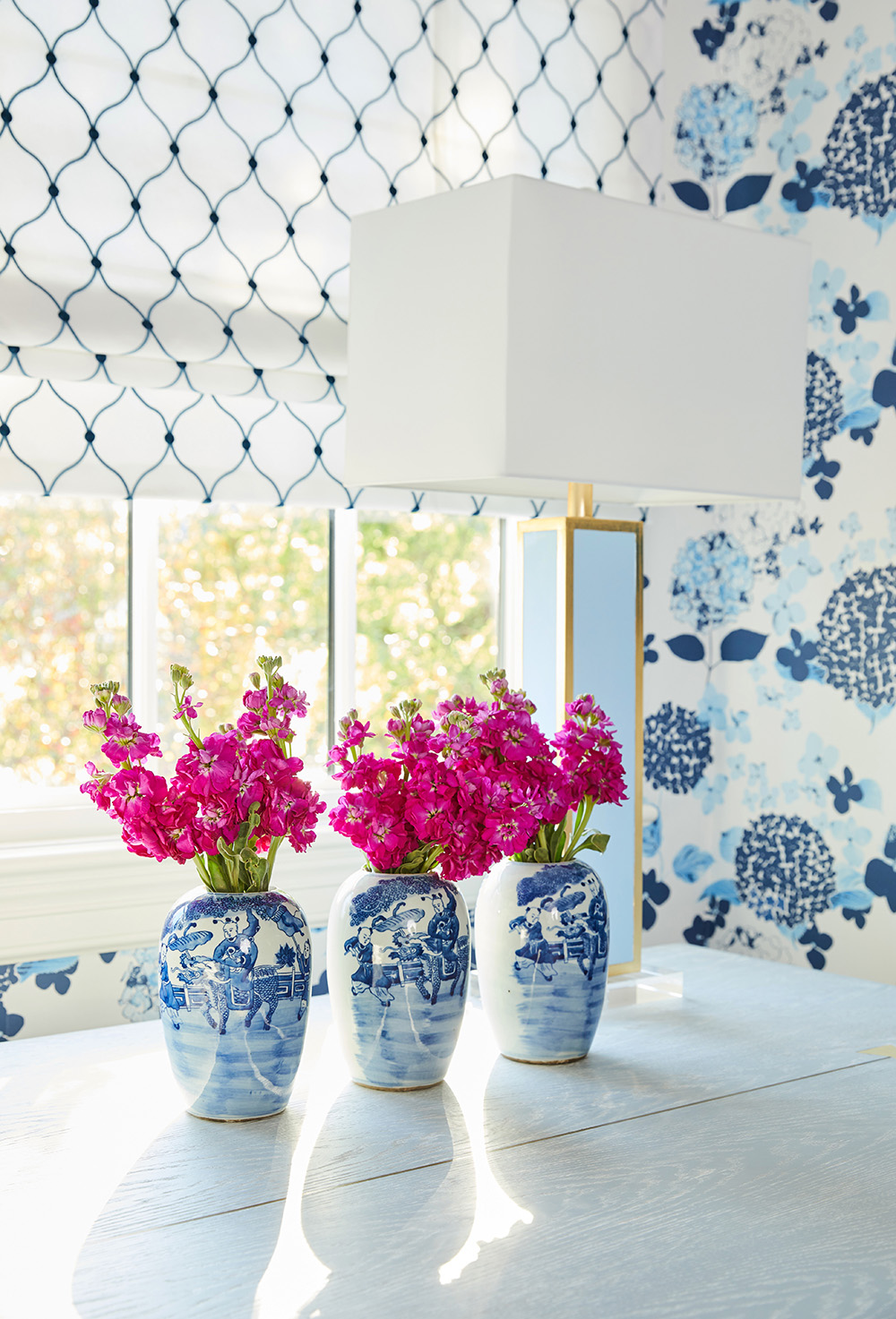
Let’s please take a moment to talk about this trio of small blue and white vases. They are the perfect height and of the prettiest Chinoiserie design. As my friend @SavoyGardens pointed out the rule of three plays out perfectly well on this desk. And also, these pretty Couture Lamps from Lamps Plus are so elegant and beautifully finished. The gold leaf, glossy light blue lacquer and acrylic base make these the chicest table lamps around.
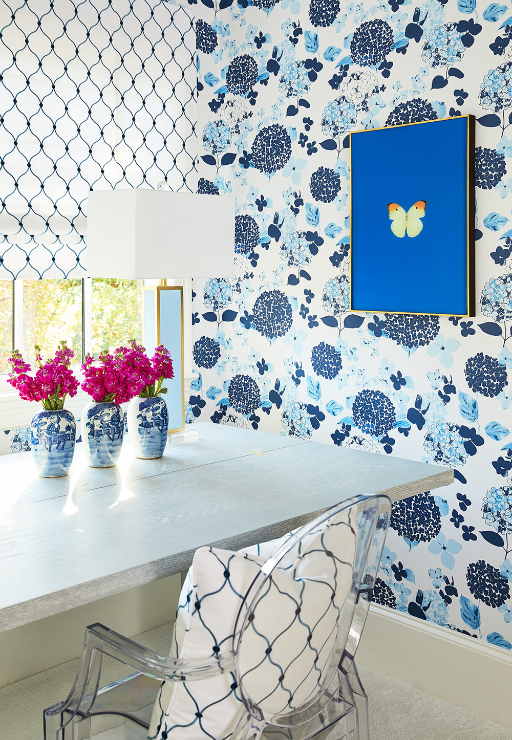
The wallpaper makes this nook extra special doesn’t it? And it’s design is perfectly balanced by the Fabricut fabric on the shade and pillow, the pretty lamps, the vibrant art and the blue and white vases.
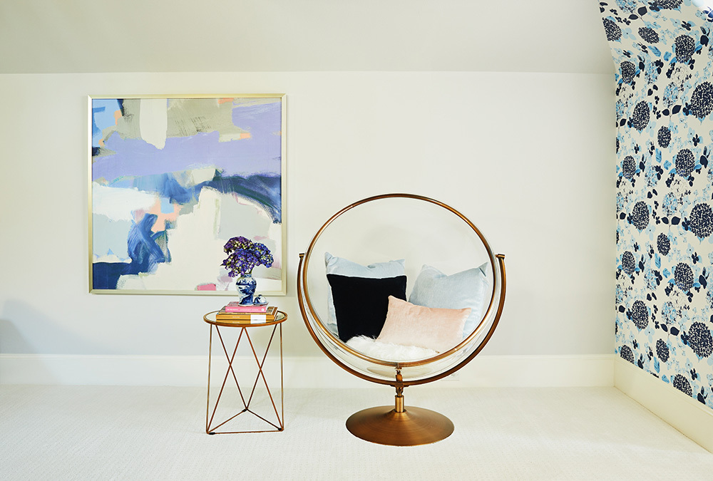
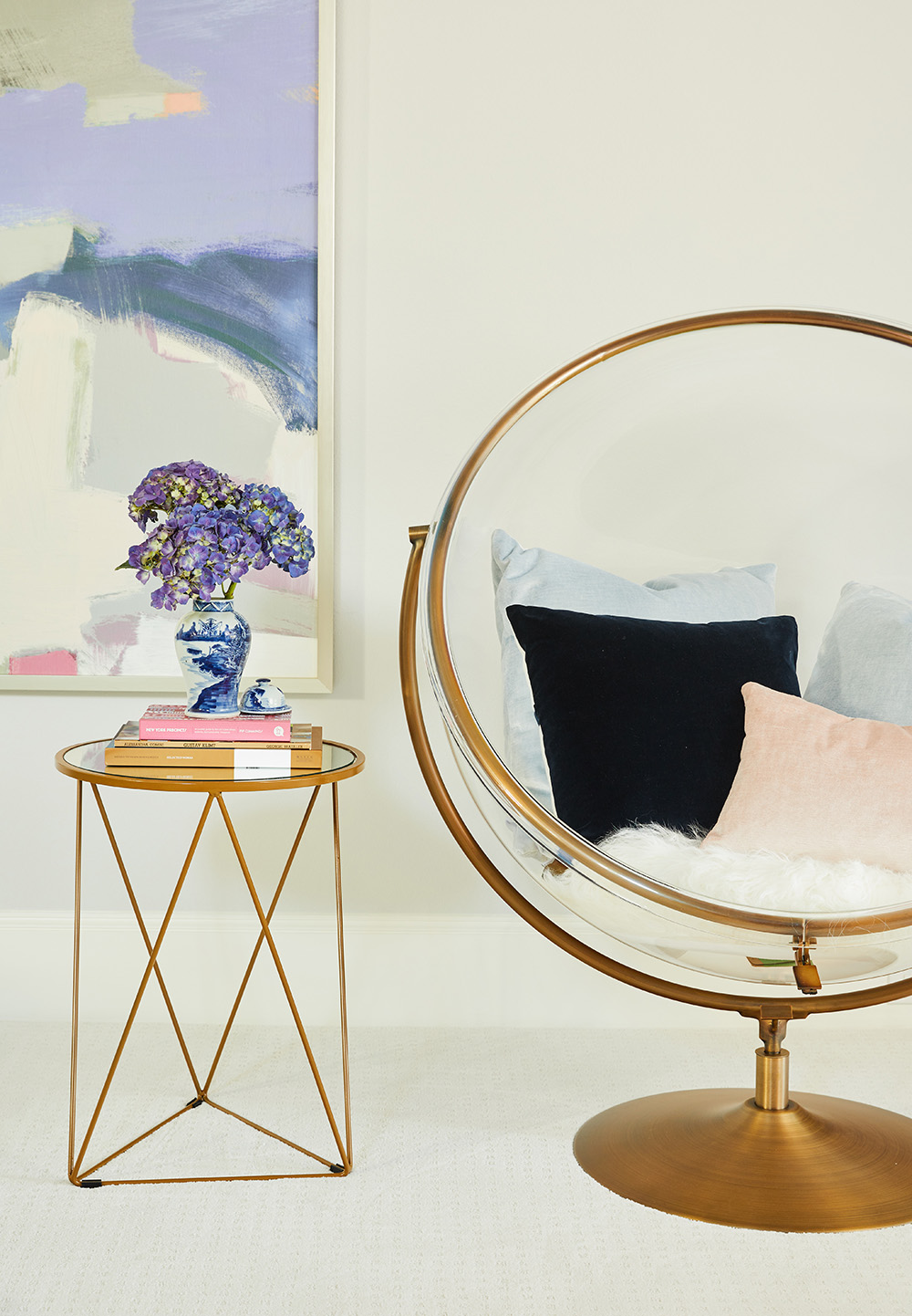
And now we must continue to another area of the room- The Reading Nook! The cozier the nook, the more reading that takes place. Good tip for parents! This fun and elegant bubble chair was made extra cozy by this blue velvet pillow made from fabric from Fabricut as well as this pink one. We added this indigo pillow by SWD Studio for a contrasting punch. Boy are these pillows beautifully made! We added the perfect accent table from HomePop and this fabulous art piece to finish off the area.
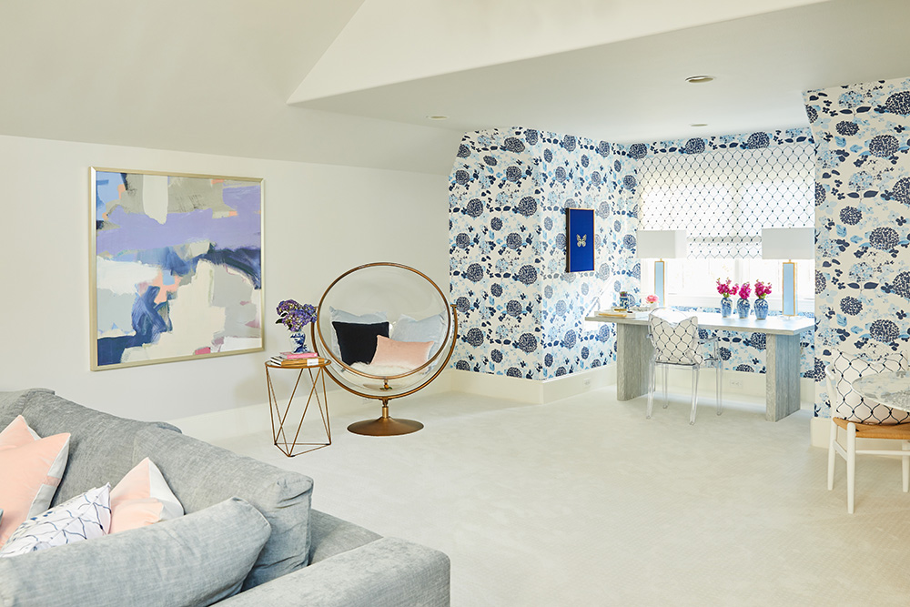
Below, you can see how the desk and reading nook relate to each other.
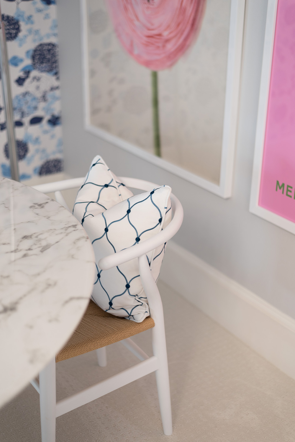
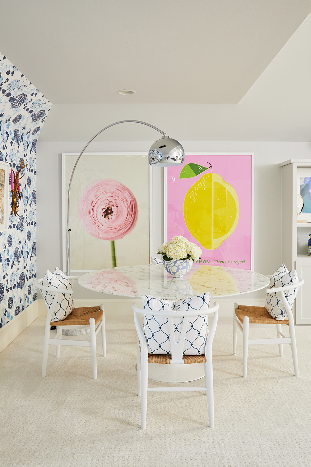
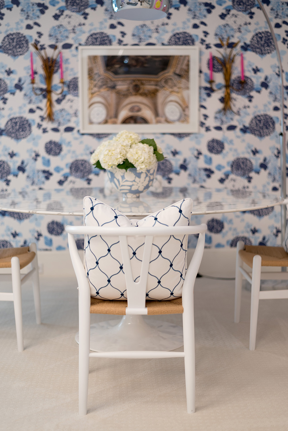
Up next- the collaboration station study area. This area is perfect for group projects and collaborative work. Of course, for this area we needed a large, good looking table, that is easy to maintain, where the girls could spread out with their books and notebooks. This 60 inch faux marble table was our perfect answer. Aesthetically beautiful, strong, stable, large and at a wonderful price point. We paired it with these really great wishbone chairs from Hayneedle (they are so comfy!) and this simply perfect and sculptural arched lamp from Lamps Plus.
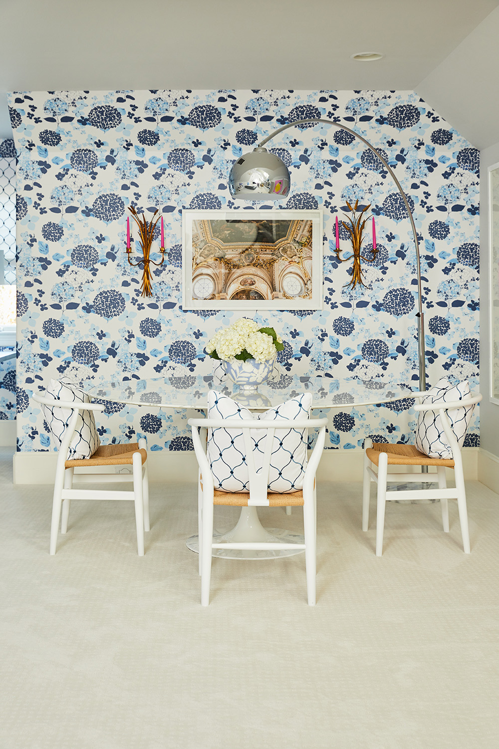
Choosing art for this wallpapered wall was a challenge, because I wanted it to be something that would greatly contrast with the wallpaper but that would not detract from it. So we chose one of my architectural photographs of the ceiling of the Royal Palace in Madrid flanked by two vintage golden sconces (similar ones here) with bright and pretty pink candles. Why pink candles? This is a tween girl’s room after all! Plus, we needed to tie in the pink to the posters on the adjacent wall.
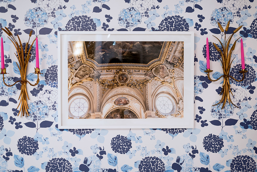
The pink candles now make sense right?!
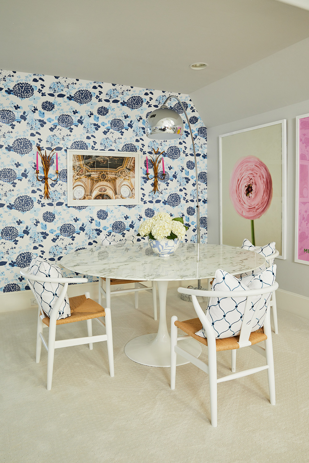
These two posters are from Minted. I wanted them to pop and make a statement in a different way than the wallpaper. I opted for their punch to come from their large size (40”x 54”) and from their contrasting color. I thought this pairing of a lemon (by Tica Lubin) and a flower (by Michelle Westling) was a fun and happy one. The pairing is unexpected and bold, exactly our intention. No one will be falling asleep here!
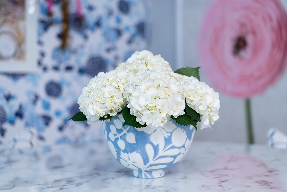
This bowl by Jill Rosenwald is everything! Mr. C loves this and now wants a whole collection of Jill’s pottery. The fun part about shopping for ceramics at Jill Rosenwald’s is that you can buy something already made or have something completely custom just for you- you can choose the shape you like, the size, the pattern and color. Check out her instagram for further inspiration.
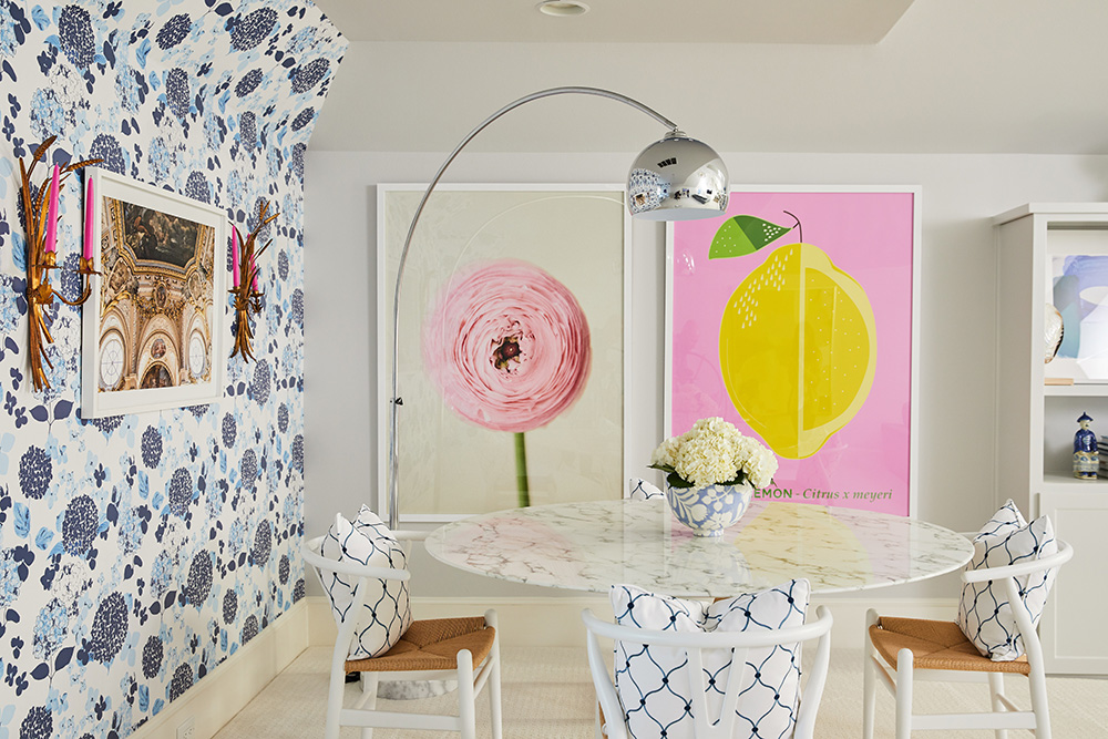
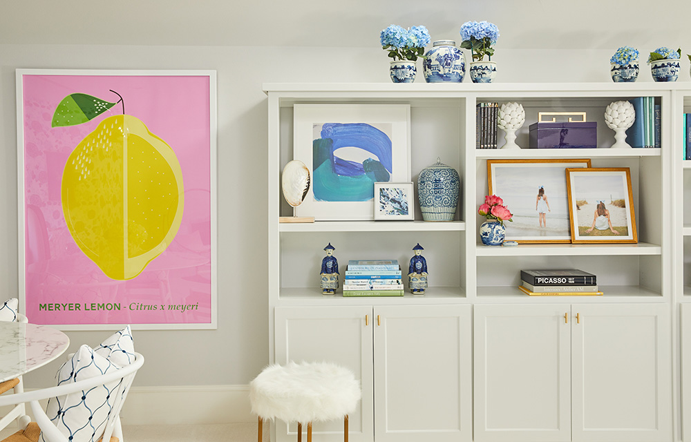
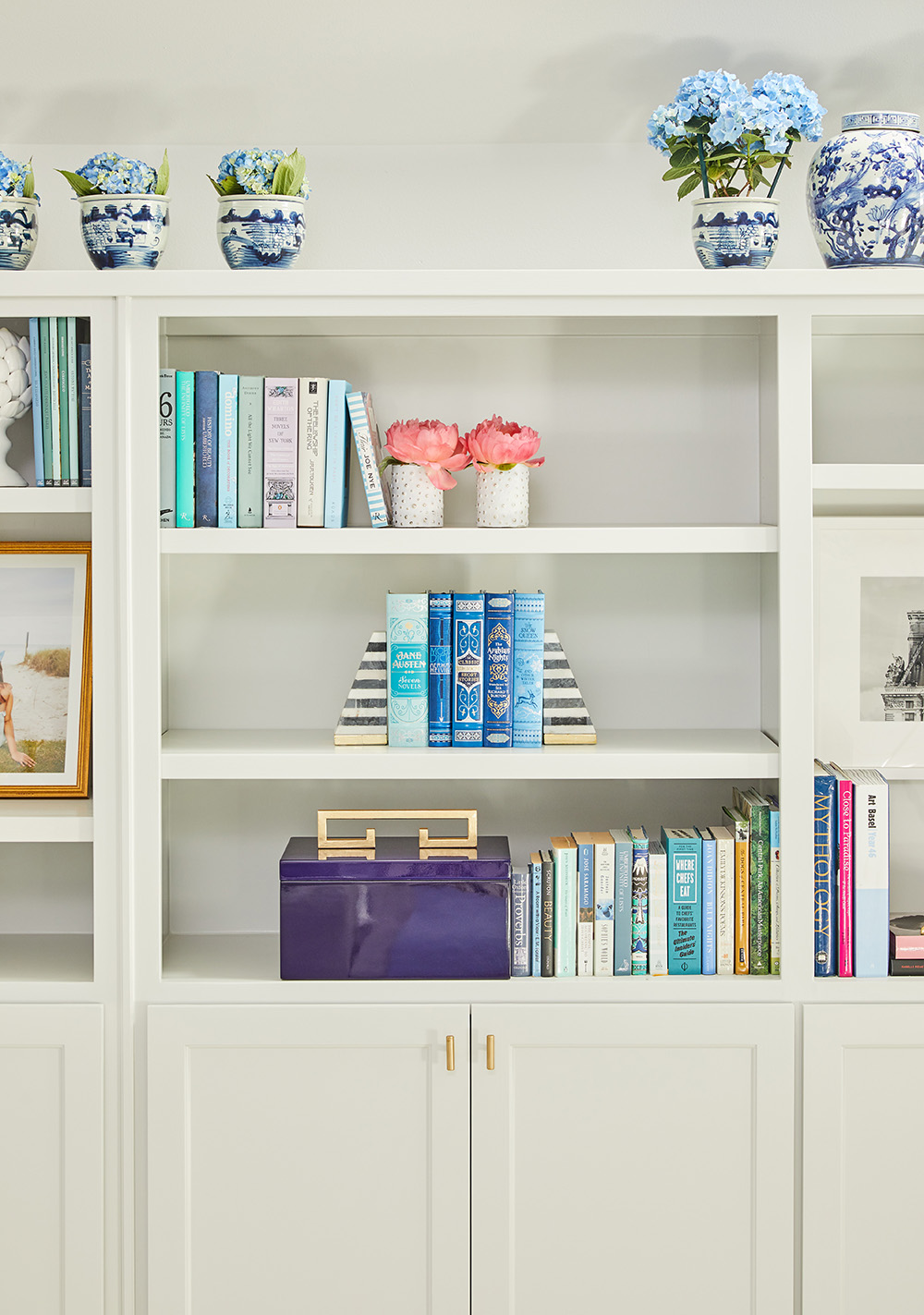
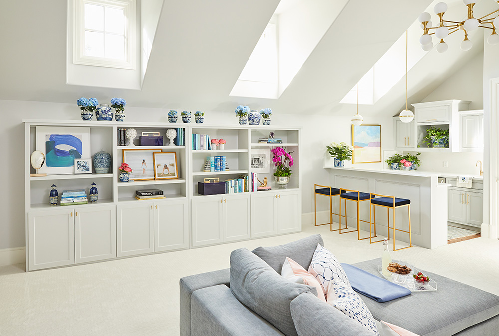
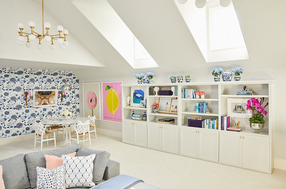
And next to this collaboration station we have the revamped bookshelf. Don’t those lower doors look so good? As I mentioned earlier, it originally had all open shelving, which isn’t great for keeping board games and toys hidden in a playroom. We needed the storage, so we set a permanent shelf and then just added doors below. This was a great way to really utilize this space and add more storage. After some paint and chic new gold hardware from Emtek we were ready to style it. It is difficult to strike that perfect #Shelfie but I think we did pretty well!
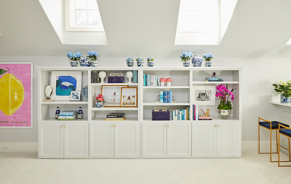
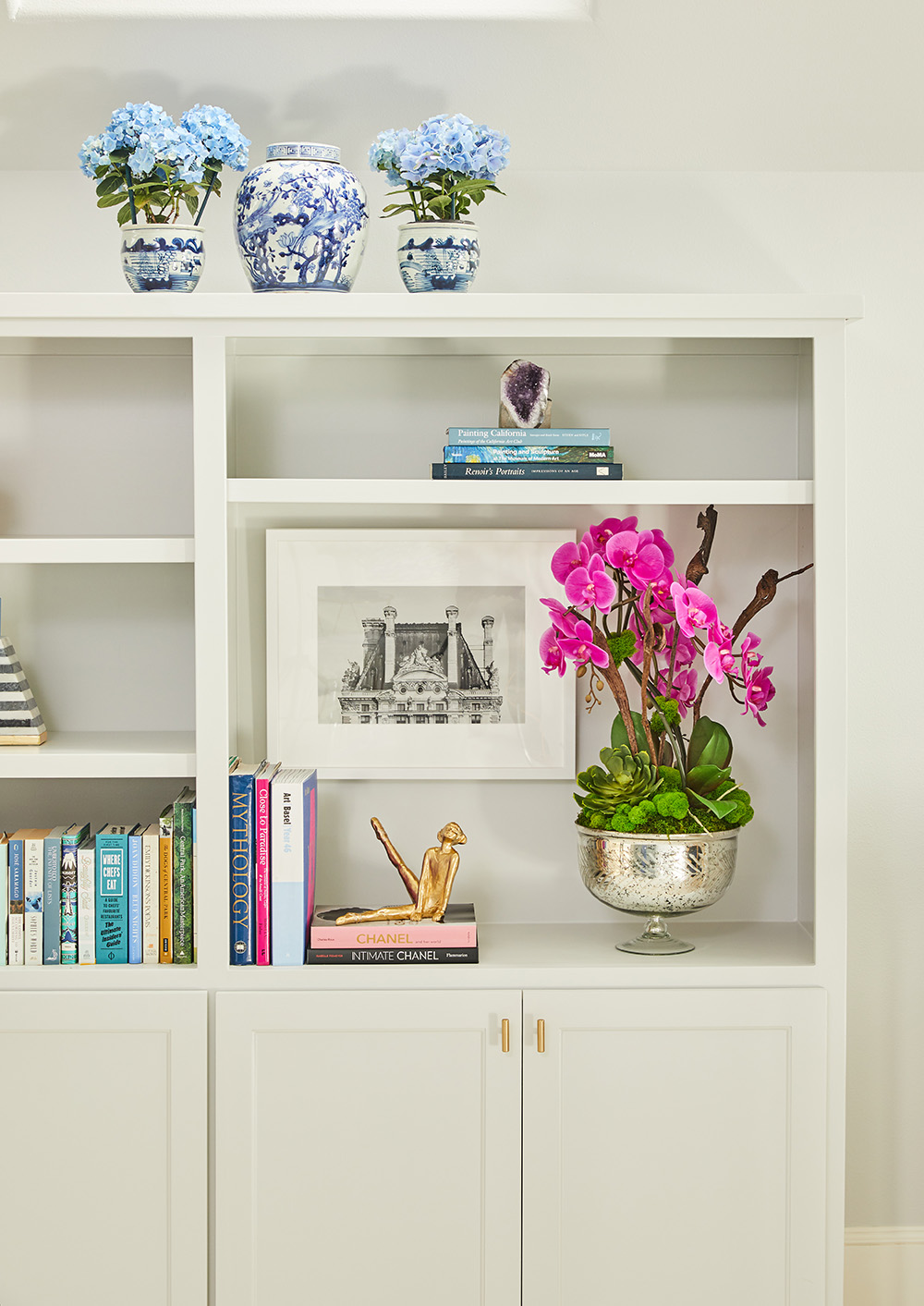
Of course, to add life and color to this bookshelf we had to add some of The Pink Pagoda’s beautiful blue and white jars. The top of the bookshelf was the perfect place to start. The slant in the roof limited the size of what we could up there, but I think the scale of these melon jars coupled by the small planters worked perfectly! Let’s dissect the bookshelf in more detail-
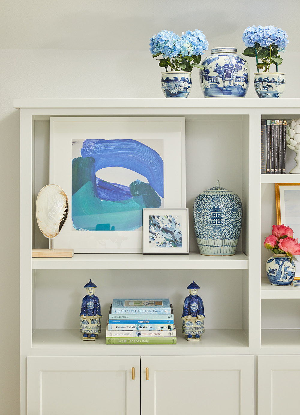
Leaning art is one of my favorite styling tricks for large bookshelves. It is the perfect way to incorporate smaller works of art that can really dress up a space. This large print is from Minted by artist Nell Waters Bernegger. I loved the mix of blues and the freedom in the strokes. I paired it with a smaller Minted print by a favorite artist and friend Katie Craig. I added some seaside appeal with one of Couture’s Mother of Pearl finials to add some height as well as another blue and white beauty from The Pink Pagoda. The two Chinese men flanking the lower level stack of books are so cute and sure know how to add some excitement.
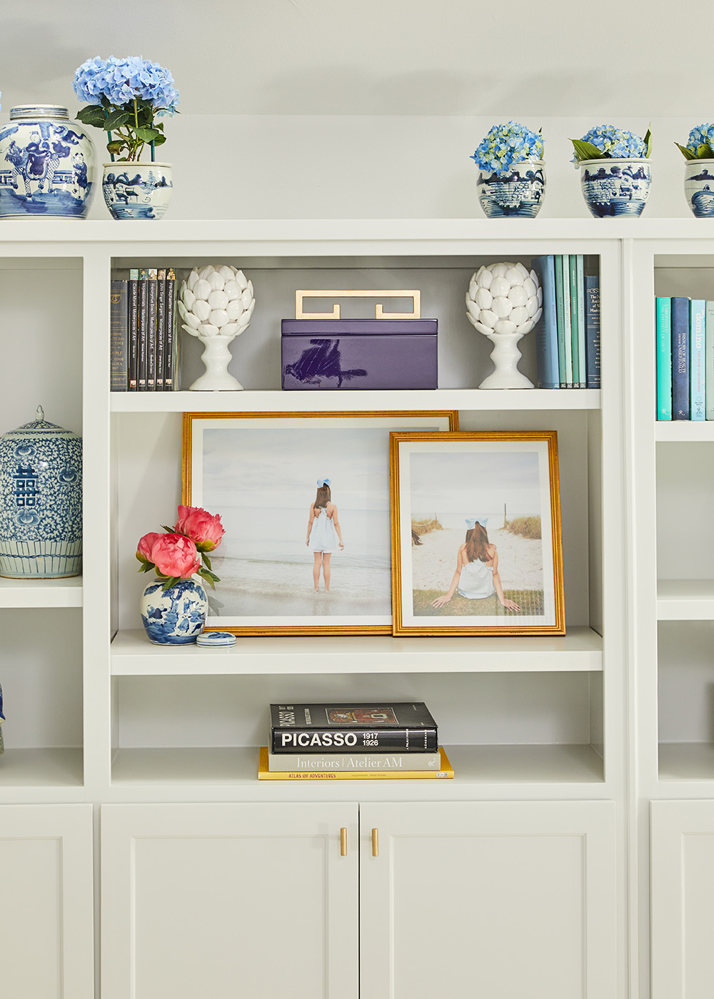
The pretty lacquered box is from Couture. You can see it’s sibling in the photo below. I love the scale on these, much larger than regular boxes and they really own their space. The striped book holders were one of those fabulous HomeGoods finds! I love going to that place! It’s like a treasure hunt.
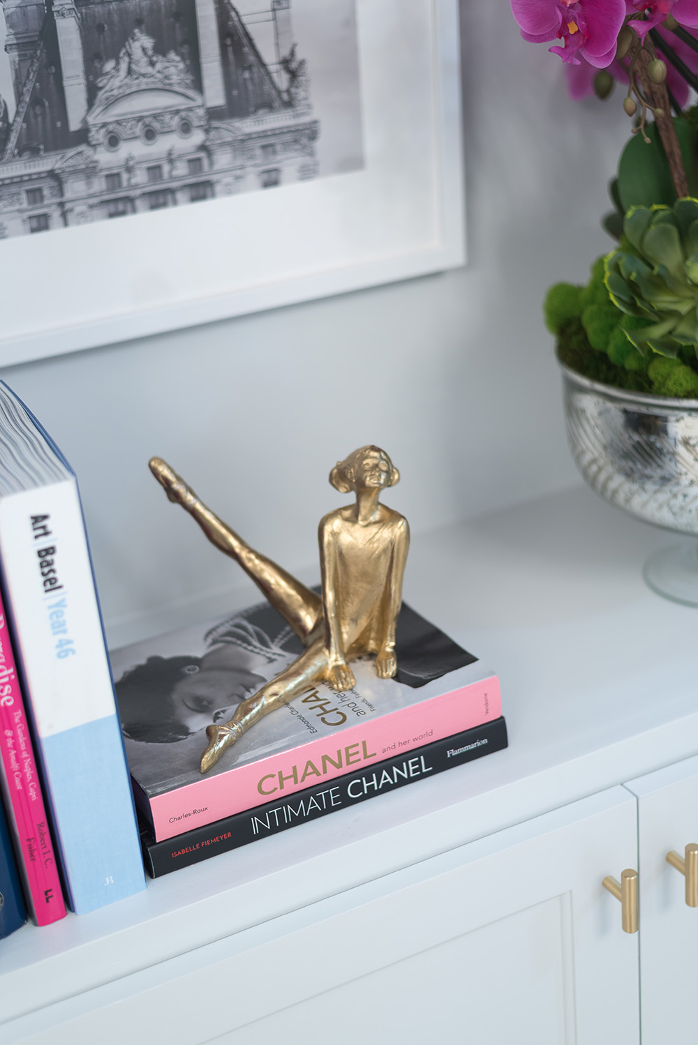
In this last section of the bookshelf we have the beautiful faux orchid from Shay Geyer in the prettiest mercury bowl. These flowers are so real to the touch it is amazing! It really takes you by surprise when you learn it is faux. Each petal is individually printed on a 3D printer! I just love how the fuchsia adds that pop of color to the bookcase, plus it has that perfect scale to counterbalance the large print on the other end. I added a beautiful photograph from Minted by artist Lindsey Ferraris of an older Parisian building. That pretty ballerina is a hand-signed sculpture scouted by Fig House Vintage. It is so fitting that our little 11-year-old is a ballet dancer. If you are looking for treasures, Fig House Vintage is a great place to start.
Now, it’s time to look up, because this room has some amazing pendant action. I cannot speak more highly of these two Hudson Valley Pendants we chose to be our anchors and main light source for the room. They are simply stunning and they elevate the space to another level completely. The scale is perfect for these high ceilings and they add that perfect modern vibe. The pendants make the room more sophisticated, inviting and so much brighter.
Let’s see these from different angles-
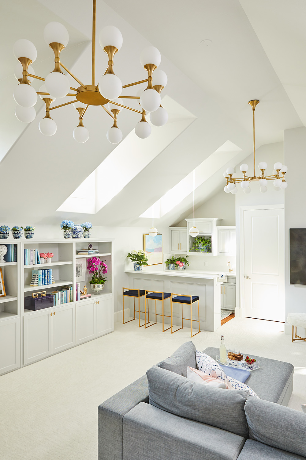
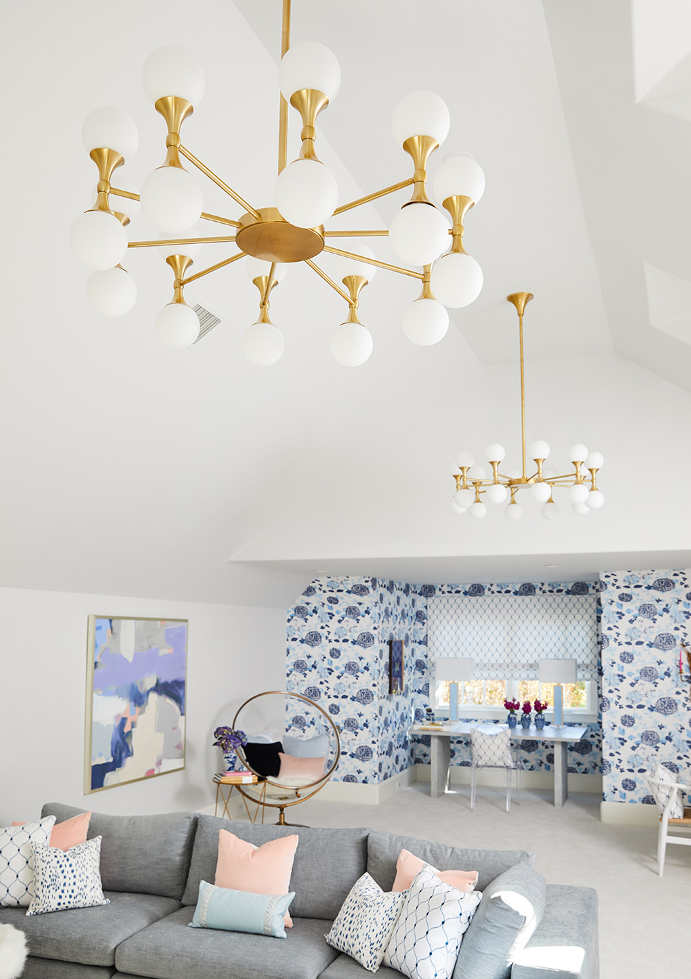
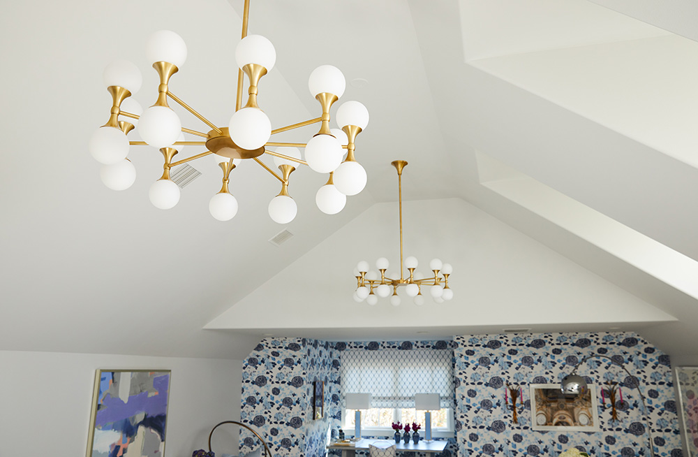
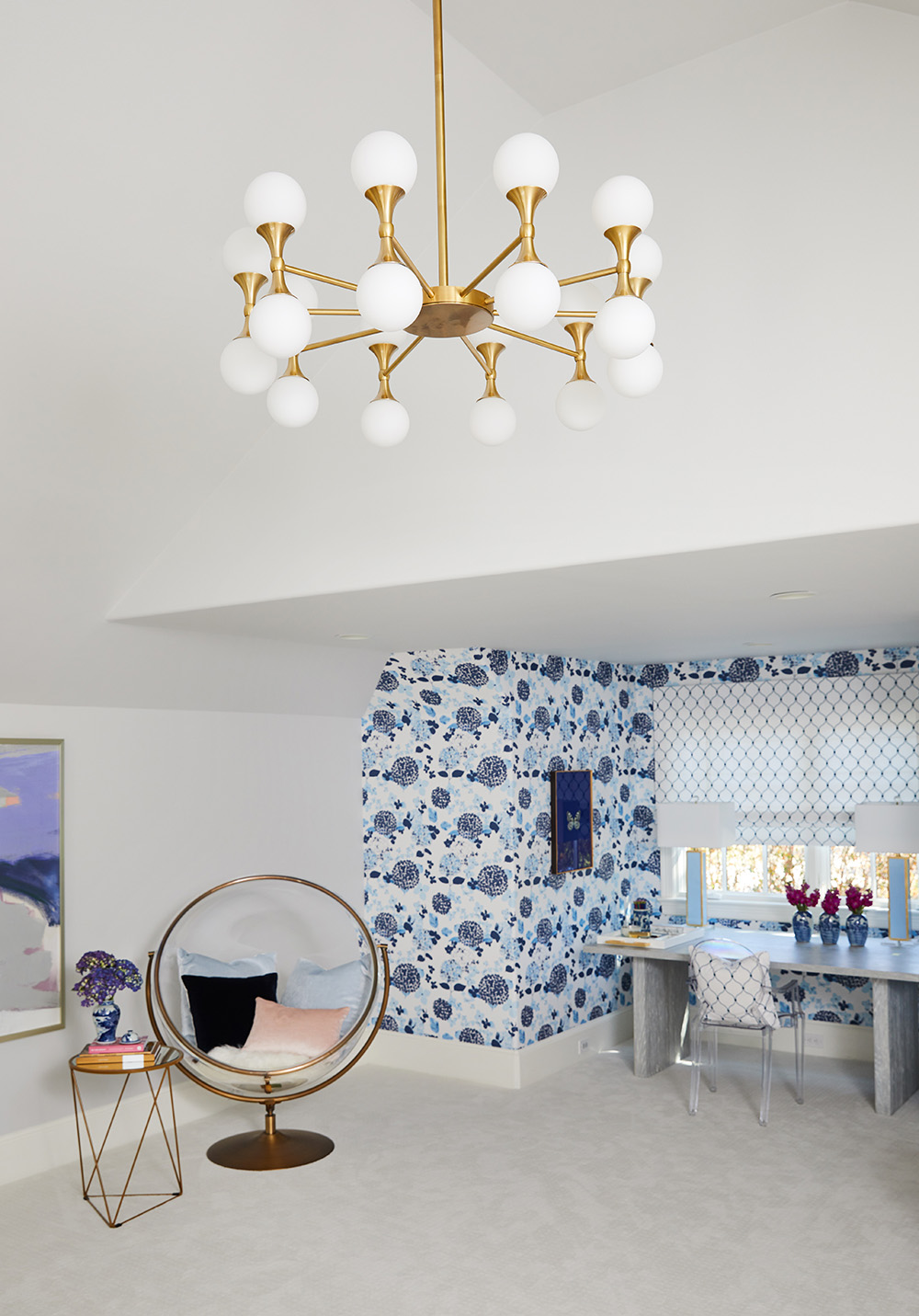
These Hudson Valley Pendants could not be better right? It’s as if they were made for the space.
The bar area also counts with divine smaller pendants from Crystorama. Don’t they go perfectly with the larger pendants? A match made in heaven! These small round pendants are designed by a favorite designer Brian Patrick Flynn, whose taste I really admire, so of course I was drawn to these from the first moment I saw them. They are small, but they certainly stand on their own very well. They are interesting and modern and just help update the look of the bar.
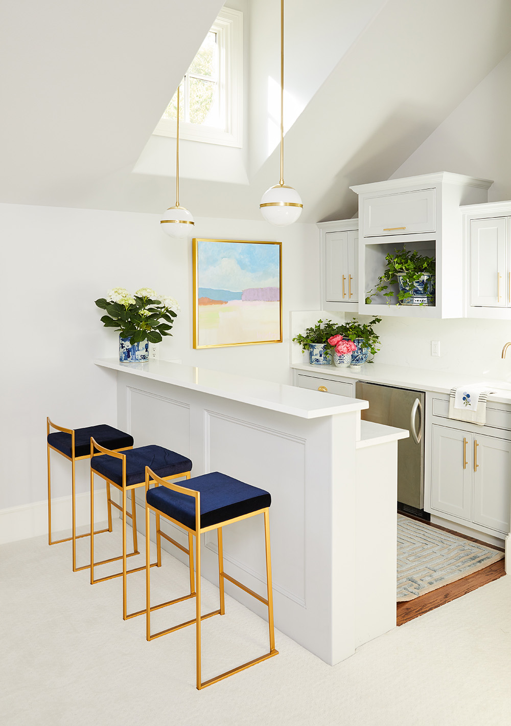
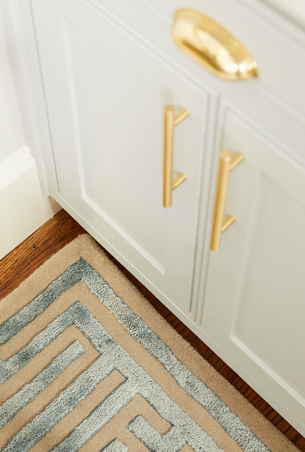
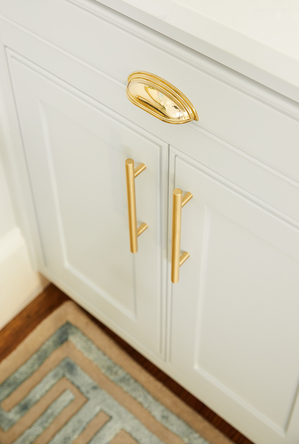
Isn’t the bar lovely??! If you remember, aside from painting we took out the black countertop and the green backsplash and we opted for a cleaner and brighter look with a white quartz. Well, the space is like night and day. We added Emtek gold hardware for the cabinets and a beautiful work of art by local artist Lindsey Meyer. I learned about her art because we use the same framer and I kept seeing her art in the store. I love this beachy scene she made to go with our color palette. It’s serene and calming. The gold frame was the perfect touch. These navy blue stools to bring in the navy from the wallpaper to the front of the room. The navy pops here, which is exactly what we wanted. We needed some blue and white pots from The Pink Pagoda (obvi) to liven up the area.
A key piece making this area special is the fabulous and totally luxurious rug from Kevin Francis Design in sky blue. This rug is DIVINE. I now want a huge one for my home. It is beautifully made and is of the best quality. Can you believe Kevin, the designer, is still in college? Cornell University’s Hospitality Management program no less? His future is bright in this field! I can predict he will be designing some fabulous hotel in some exotic location very soon.
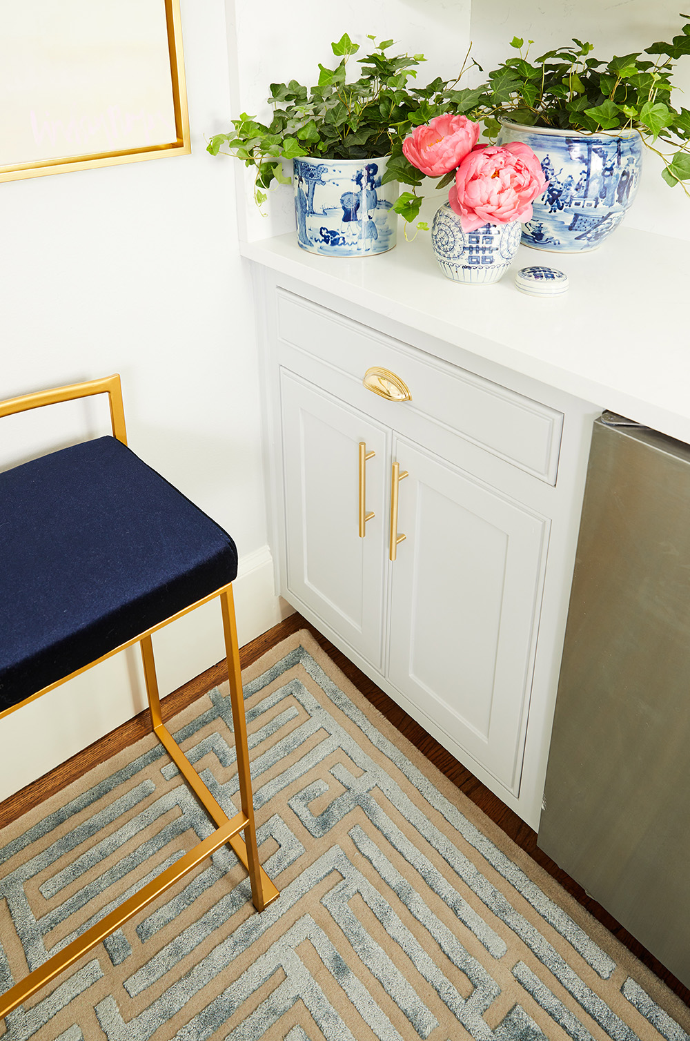
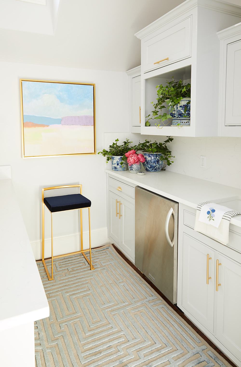
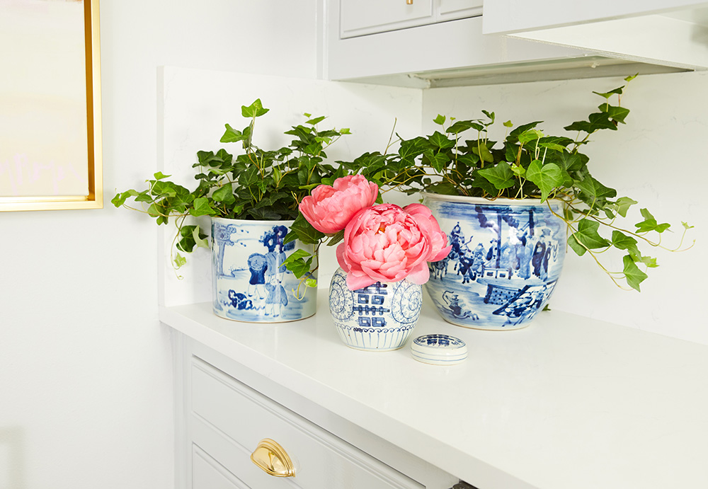
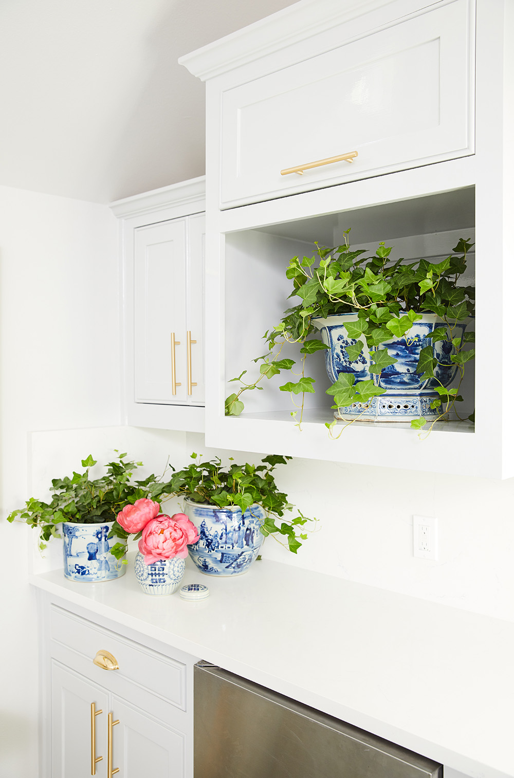
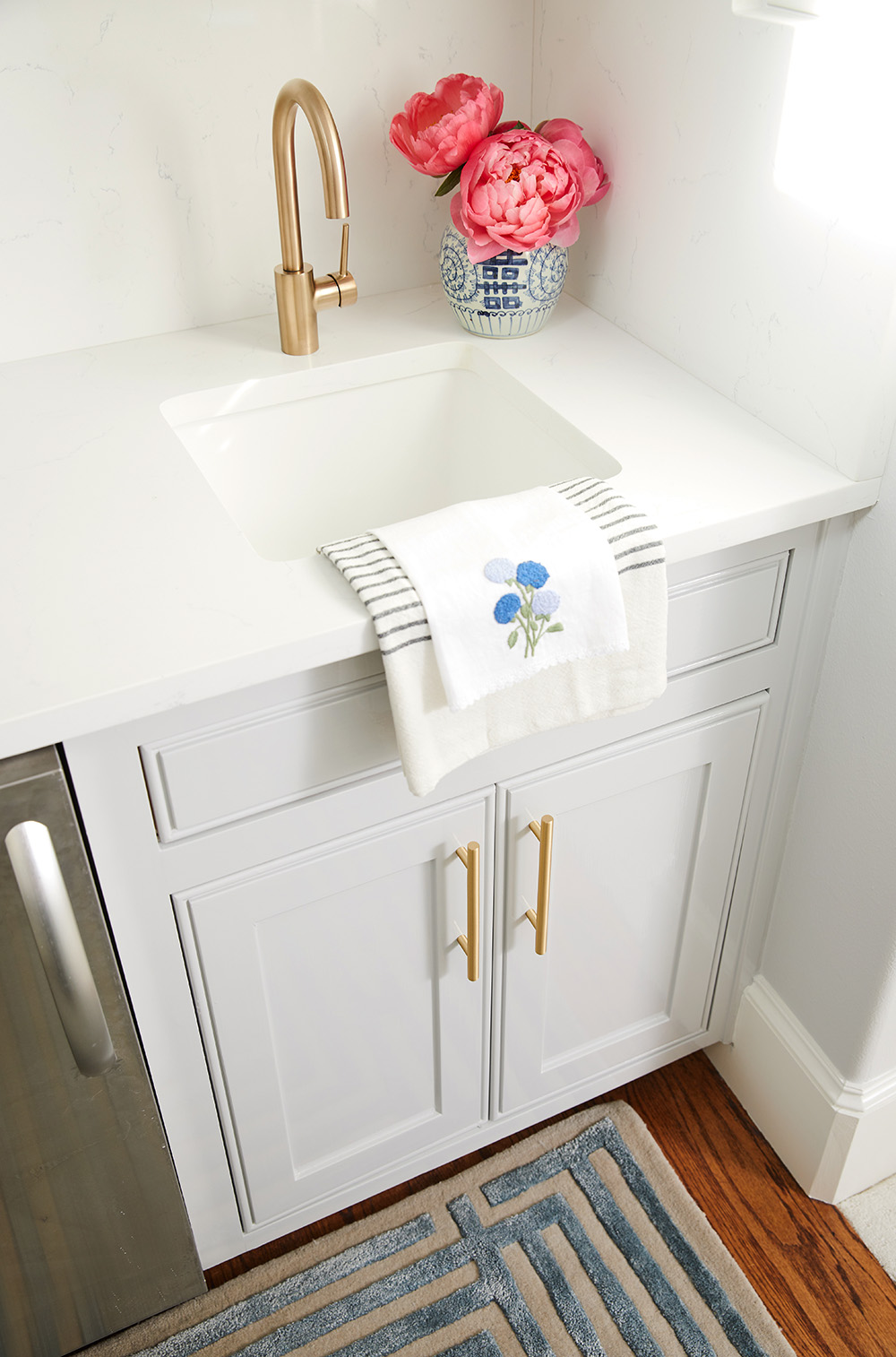
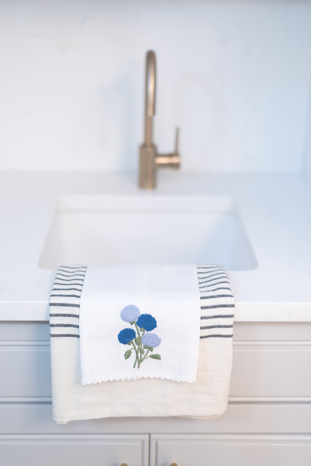
That pretty little embroidered guest towel is from Hibiscus Linens! Mariana is an adored friend who is so talented! When I saw her hydrangea pieces at Ellis Hill I had to give one to Mrs. C. It was meant to be!
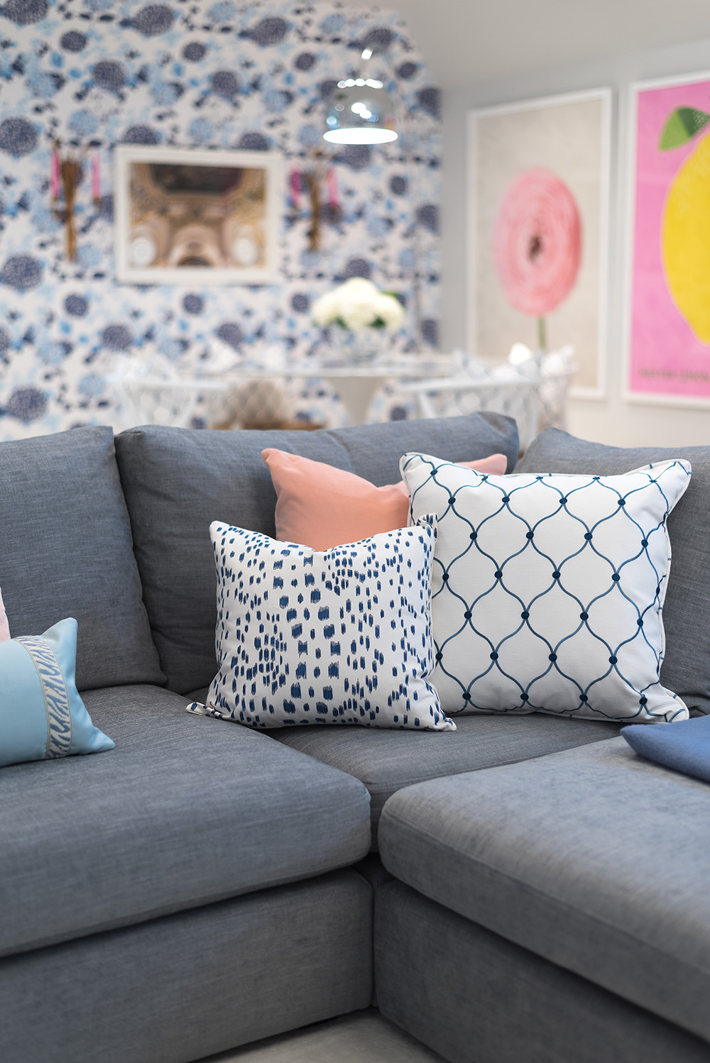
And finally, the tv watching/lounging section of our fabulous playroom! This area is anchored by the Article.com sectional adorned in the prettiest throw pillows by SWD Designs, Arianna Belle’s Les Touches and blue lumbar and ones from our Fabricut fabric of choice.
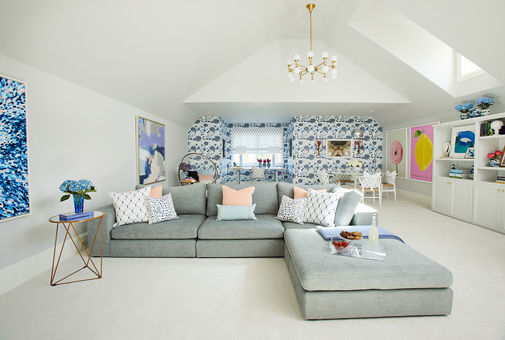
This sectional is so comfortable and of great quality.
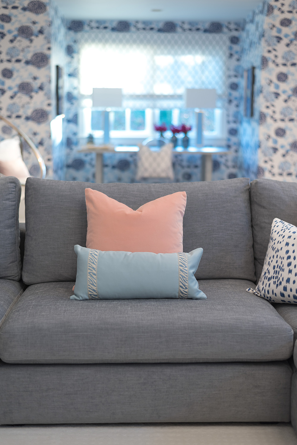
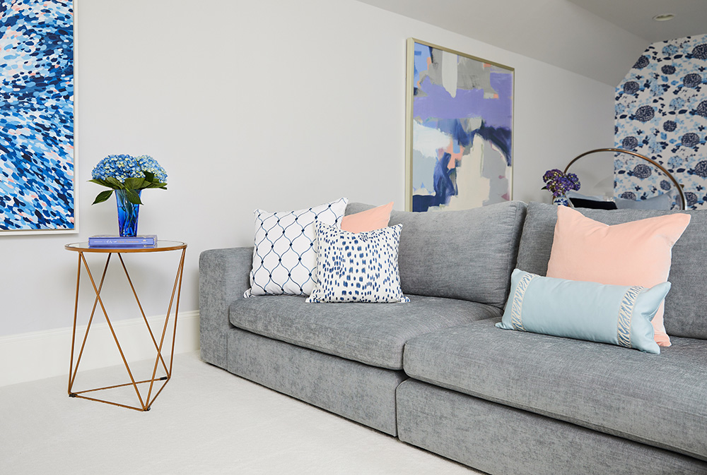

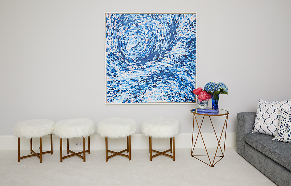
This painting!! This beautiful commission by local artist and friend Katie Craig is perfection! It brings in the navy and blues from the back wall and just adds so much depth and interest to this area. I’m a huge fan of Katie’s (see here and here) so we are honored to have one of her beautiful pieces in our space. The furry stools from HomePop are the cutest!! They are so comfortable to have in the room. The girls put their feet up on them while watching movies or sit on them to play and chat. They are soft, of great quality and totally adorable! And, of course we have another cute accent table by HomePop in case anyone needs to lay down a drink.
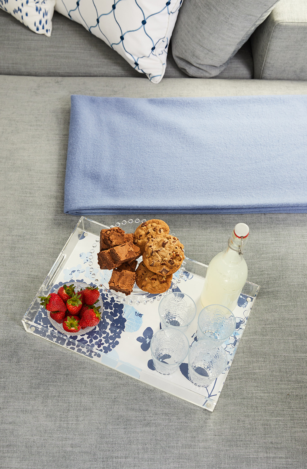
The perfect way to bring the wallpaper in to this area….add an acrylic tray with the paper design at the bottom! Cookies anyone?
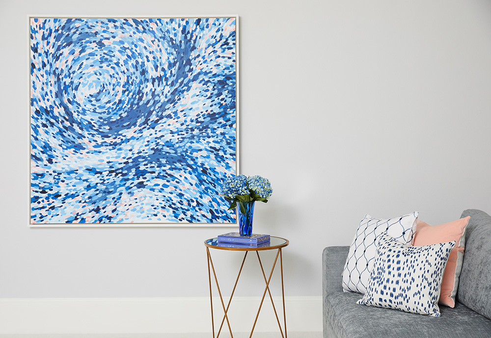
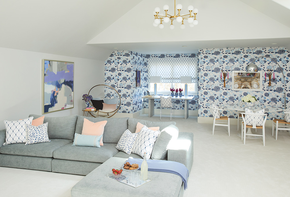
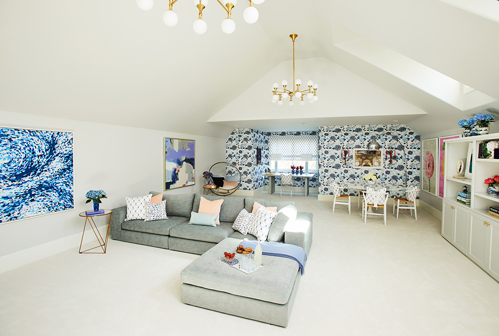
Perspective! So you can get a sense for the room in its entirety. (The bar is to the right of where this photo was taken). We are so happy with how beautiful and functional our room is. This is a place for studying, reflecting, growing, maturing, learning, resting, creating, entertaining, playing and imagining. I can’t envision a better place for sweet S. to spend her time in the next crucial years. This room is a mix of elegant, youthful, modern, fresh and fun that we can’t help but adore. I hope Mr. and Mrs. C and Little S. will spend many happy hours up here!
A huge thank you to Linda for inviting me as one of the featured designers for this round. It has been stressful and fun, but mostly such a rewarding journey. Thank you so much for this special opportunity to be among such a great group of creatives. Another thank you to Jennifer from The Pink Pagoda for letting me be the first one to use her first wallpaper design (can’t wait to see more!).
Another HUGE THANK YOU to all the SPONSORS who made this room possible! You were all so wonderful to work with. You were flexible and helpful and had the best collaborative spirit. THANK YOU!!
